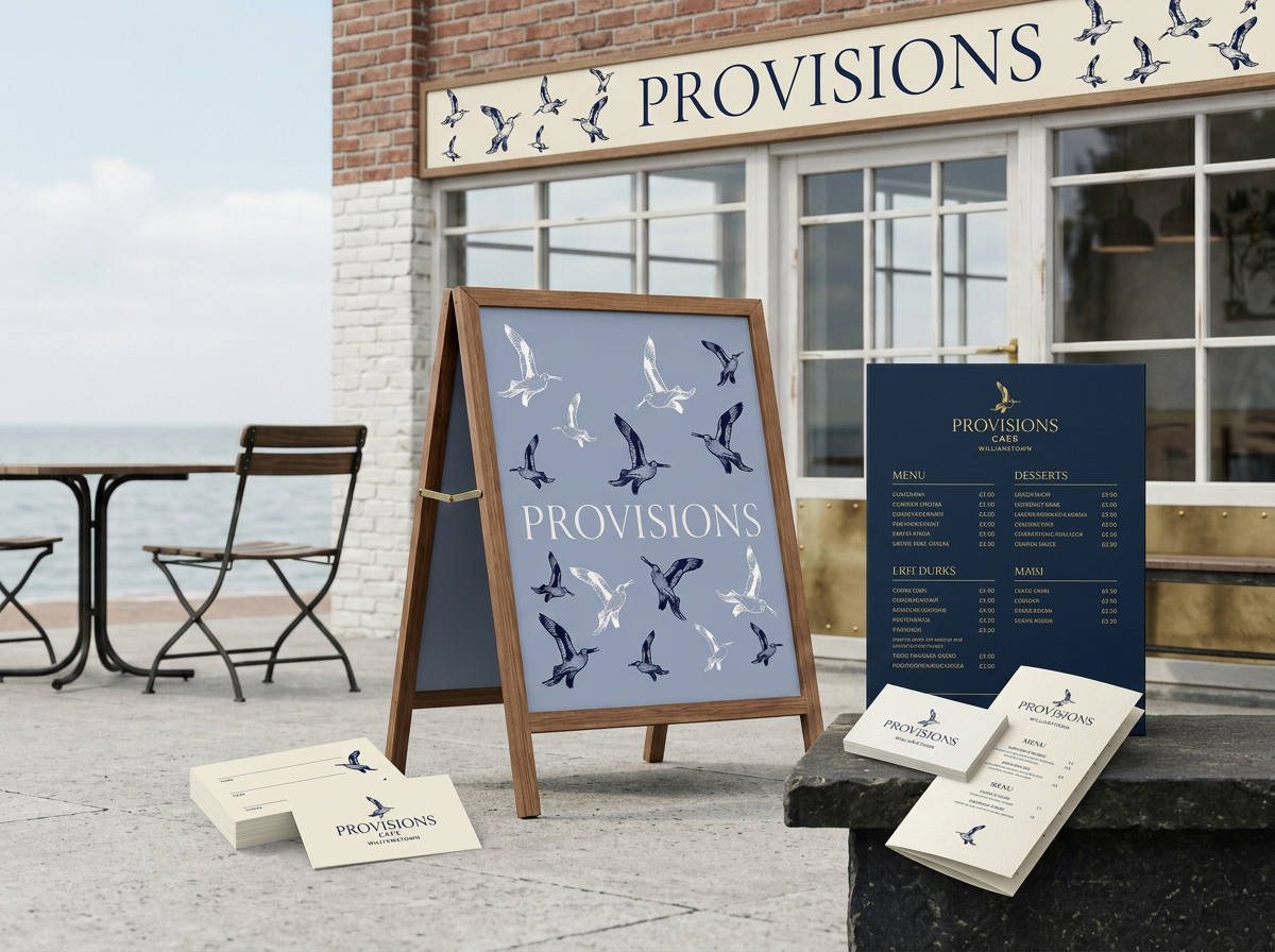
01
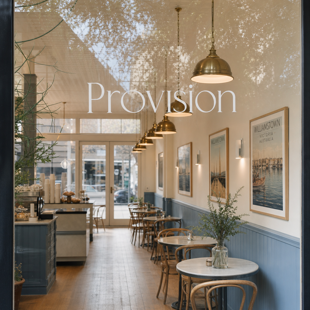
Street
Shopfront, blade and A-frame signage create a clear first impression from the footpath.
About this project
This is a complete brand identity for Provisions, a new café and pantry in Williamstown, Victoria. The brief called for an identity that felt genuinely coastal — rooted in the suburb’s maritime character — without resorting to nautical clichés. This presentation covers the full identity system: brand mark, colour palette, packaging, signage, uniform, and retail touchpoints.
01 · Brand idea
The Seagulls have called Williamstown home since 1878 — so the bird arrives already loaded with local meaning. Add the waterfront setting, and the inevitable relationship between seagulls and good food, and the choice makes itself. The identity doesn't need to explain itself to a Williamstown local. It just fits.
Made for the daily migration.
The shorebird becomes a symbol of ritual: leaving, returning, and finding your place at the table.
The identity pairs expressive, archival bird illustrations with a quiet editorial wordmark. It feels coastal without becoming nautical; premium without losing the warmth of a neighbourhood.
Interior connection
Same identity, richer sense of place.
Plain finish · Arch detail
Warm oak · Restrained brass
Interior
The brand doesn't stop at packaging — it carries straight into the space. Sky blue arches echo the midday sky over the bay. Warm oak floors and restrained brass fixtures ground the room in coastal calm. Williamstown heritage posters layer in local story without clutter.
Every interior choice is a continuation of the same palette: navy, sky blue, warm timber and brass. The result is a café that feels discovered, not decorated.
Sky-blue arches
Arched detail painted in Williamstown Blue — a direct nod to the bay sky.
Oak flooring
Warm oak underfoot that mirrors the timber tones in the brand palette.
Brass lights
Restrained brass fixtures add quiet luxury without competing with the mark.
Williamstown posters
Heritage prints in harbour navy, connecting the walls to the suburb’s story.
02 · Core palette
#0B153D
The colour of the bay at dusk. Primary wordmark and all print touchpoints.
#A4B1CA
A soft midday sky. The dominant field colour across all packaging.
#E9D48B
Warm afternoon light. Used sparingly as an accent across menus and labels.
#F5F0E6
The base — clean, warm, never stark white.
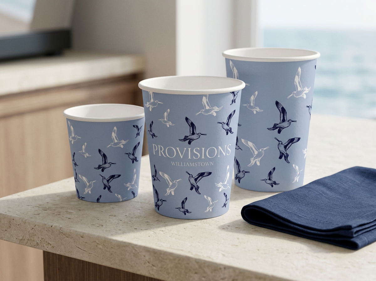
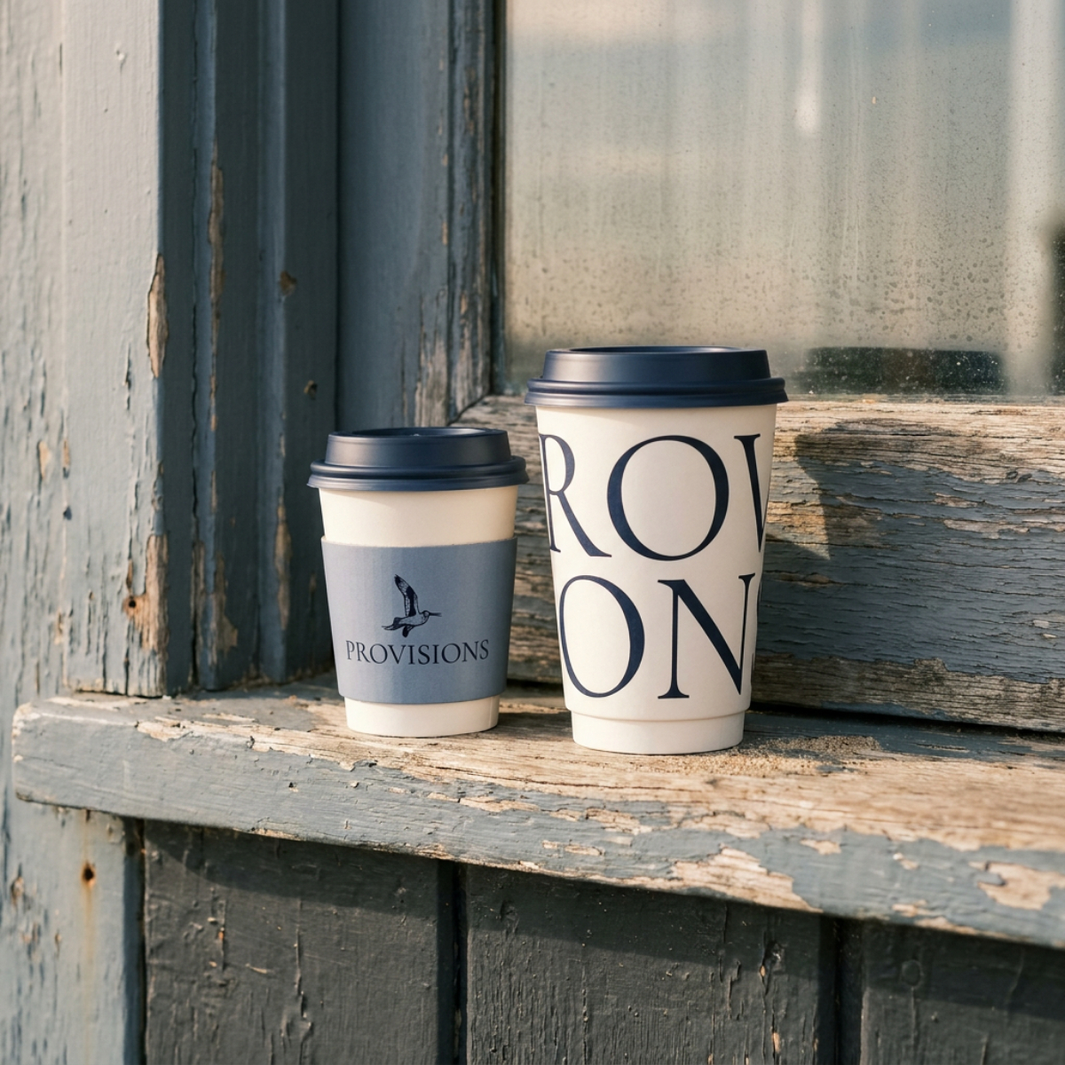
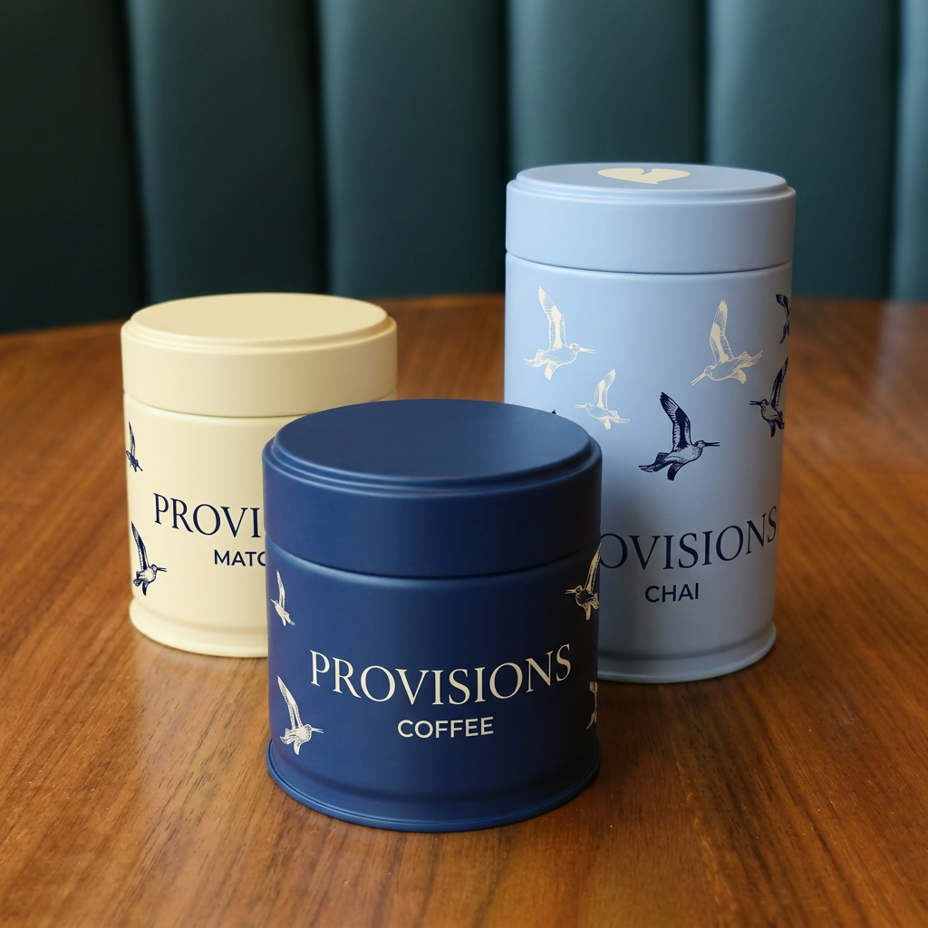
03 · Packaging system
8oz · 12oz · 16oz
Water-based inks · Recyclable stock
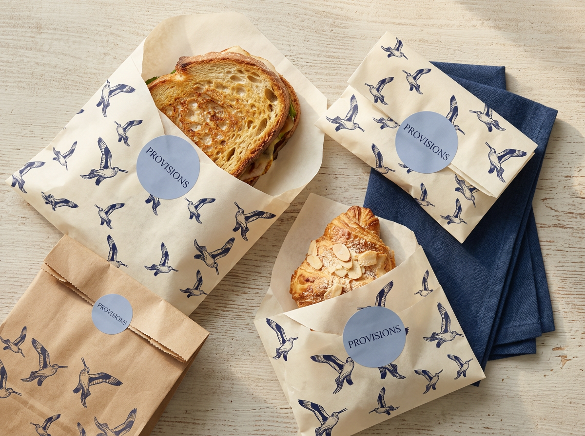
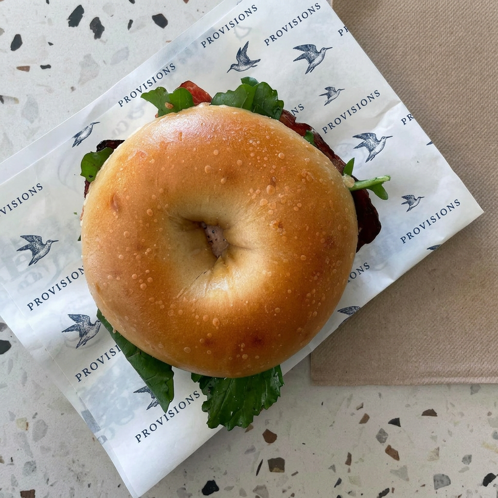
04 · Food packaging
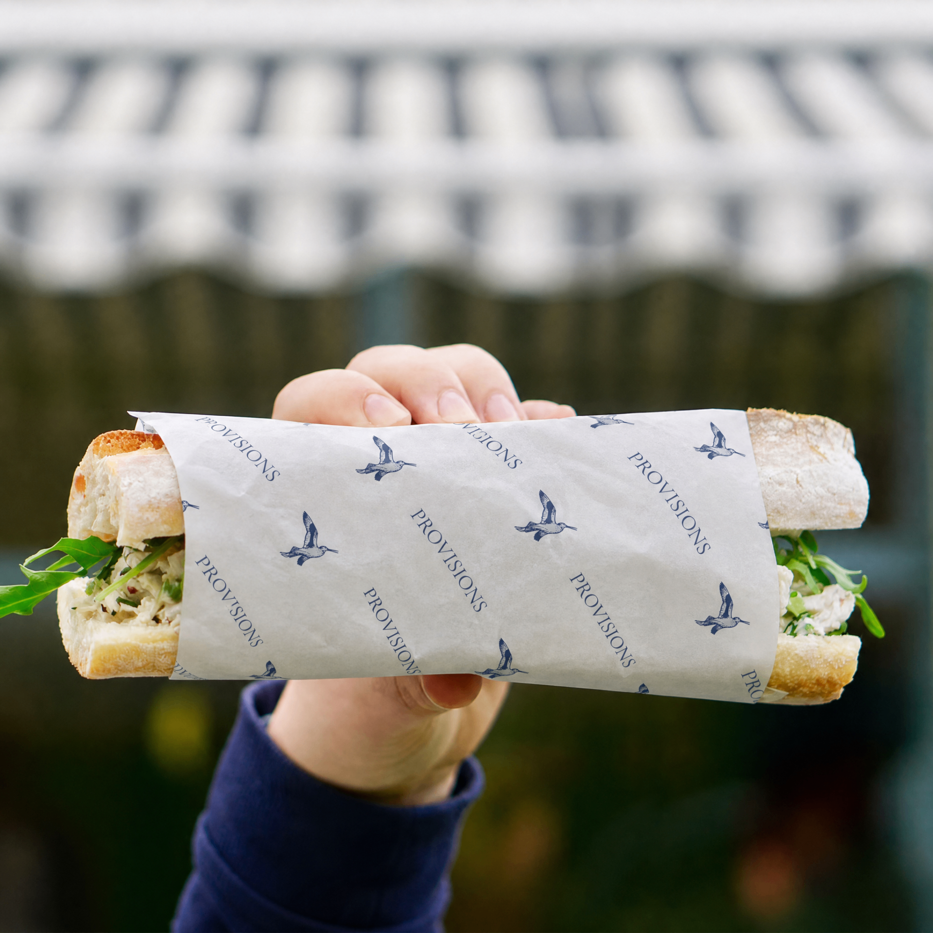
Greaseproof butter paper carries the bird pattern in one-colour navy ink. Powder-blue seals create a simple system for sandwiches, pastries and pantry goods.
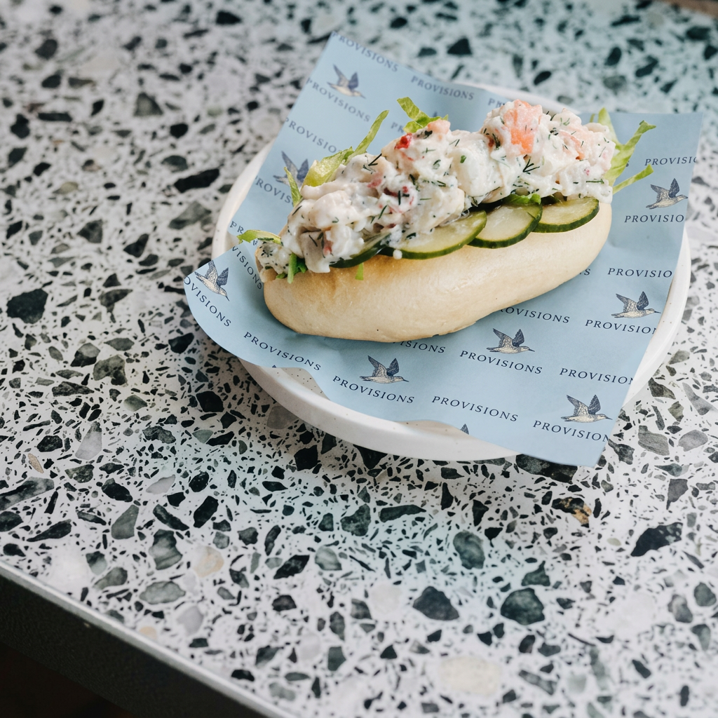
05 · Place & signage
Storefront, pavement sign, menu and stationery sit together as one calm environmental system—clear, coastal and unmistakably Provisions.
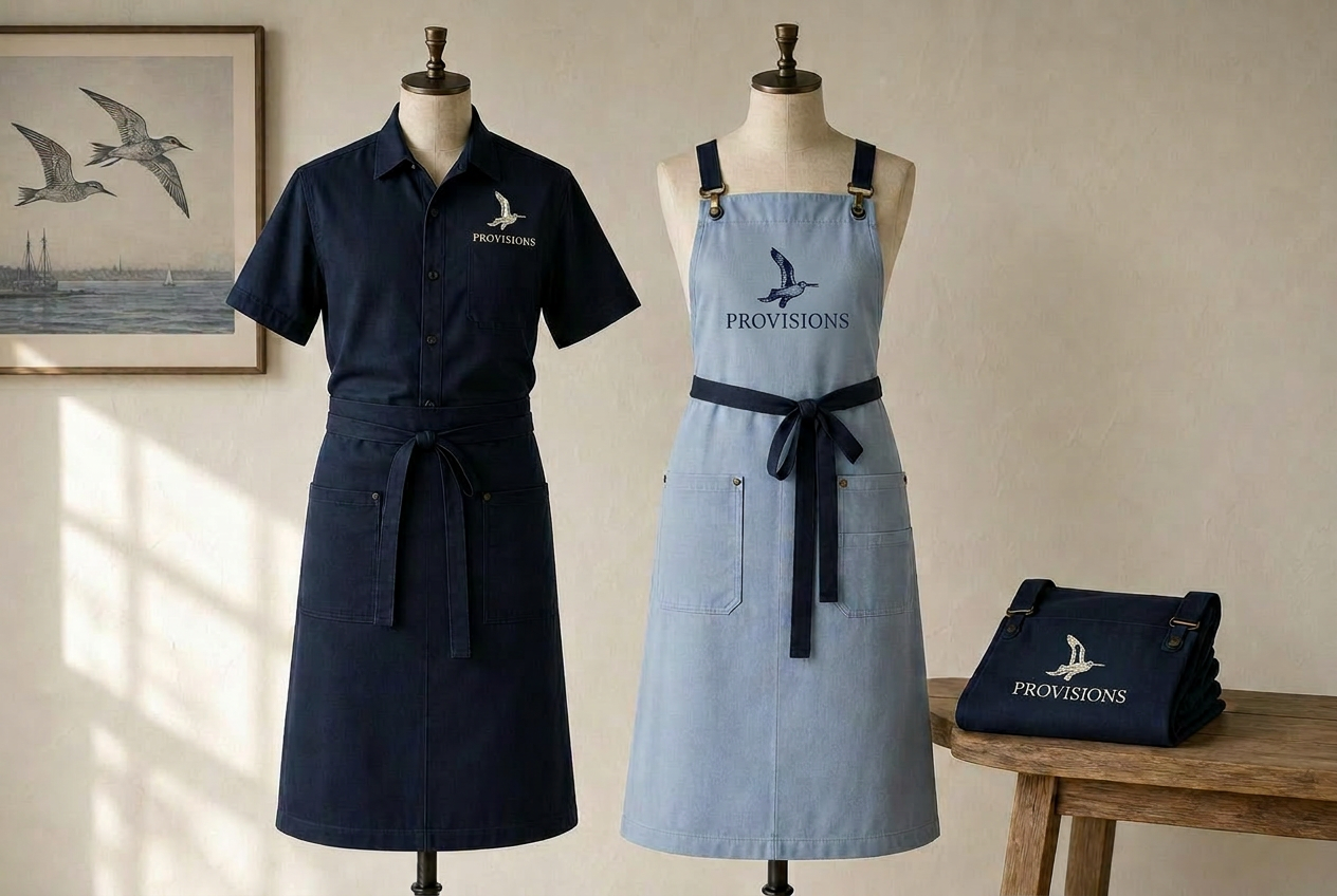
06 · Uniform & apron
A deep navy service shirt and apron pair with a sky-blue cross-back apron. One seagull sits above the Provisions wordmark, embroidered simply to keep the garments clear and practical.
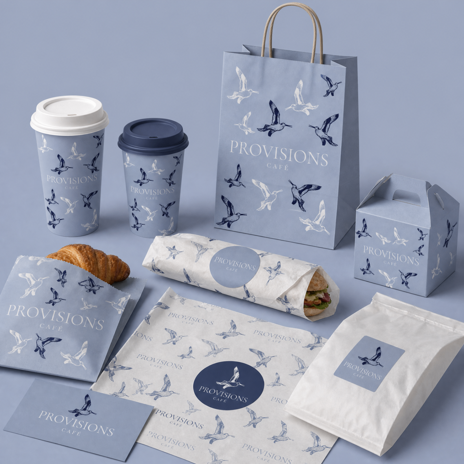
07 · Takeaway range
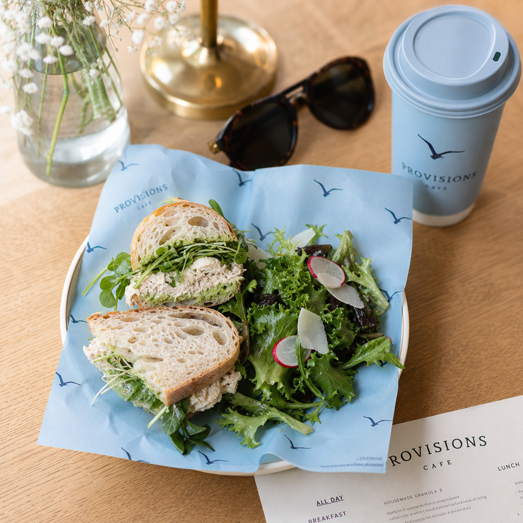
Food, pantry and counter items are grouped by use, with the original bird artwork carrying consistently across every format.
08 · In use
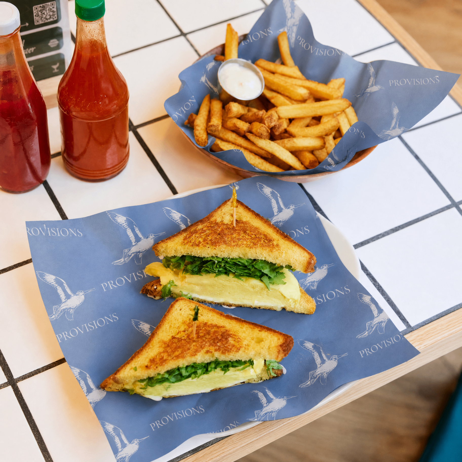
The identity comes alive through the everyday ritual: coffee on the go, sandwiches wrapped by hand, and deli paper working across dine-in and takeaway service.
Brand voice
Every touchpoint — from the cup to the counter — should feel like a familiar hello.
Brand journey
From first impression to daily ritual.
01
Shopfront, blade and A-frame signage create a clear first impression from the footpath.
02
Opening hours, entrance branding and window details make every arrival feel considered.
03
Menus, coffee cups and counter touchpoints turn ordering into a recognisable ritual.
04
Branded deli paper, plated food and a calm coastal table setting make every meal feel considered.
05
Cups, bags, wraps, loyalty cards and packaging carry the experience into the day.
06
Customer photography and social content give the community a brand moment worth sharing.
Slide to explore
Provision Café has the opportunity to become a complete hospitality destination where branding, interiors and customer experience work together to create a memorable connection with the Williamstown community.
What happens next
We’d love to hear your thoughts. Once you’re happy with the direction, we’ll move into print-ready artwork and production specifications.